← Back to featured work

Enterprise E-commerce Redesign

Streamlining the B2B Cycle

Redesigning a B2B catalogue for retail teams who needed faster inventory scanning, while bringing the experience closer to the brand's consumer e-commerce.

context

Context and challenge

The existing product listing relied on a single list view. It showed only a few products at a time while leaving large areas of the desktop canvas unused, slowing down the work of scanning availability, stock and product variants.

My role and team

I designed and iterated the PLP and PDP with a senior product designer, a product manager and a business analyst. The senior designer and business analysts led user interviews and prototype sessions; their findings shaped the alternatives we explored and the changes we made after release.

starting point

More space was not creating more visibility

What retailers needed

Experienced store teams needed to compare products and check stock quickly. Interviews showed that the old list used the available space poorly and made it difficult to see enough of the catalogue at once.

What the business needed

The company was bringing its B2C and B2B products into a more cohesive design system. New store employees and customers viewing products with staff already recognised the visual language of the consumer site.

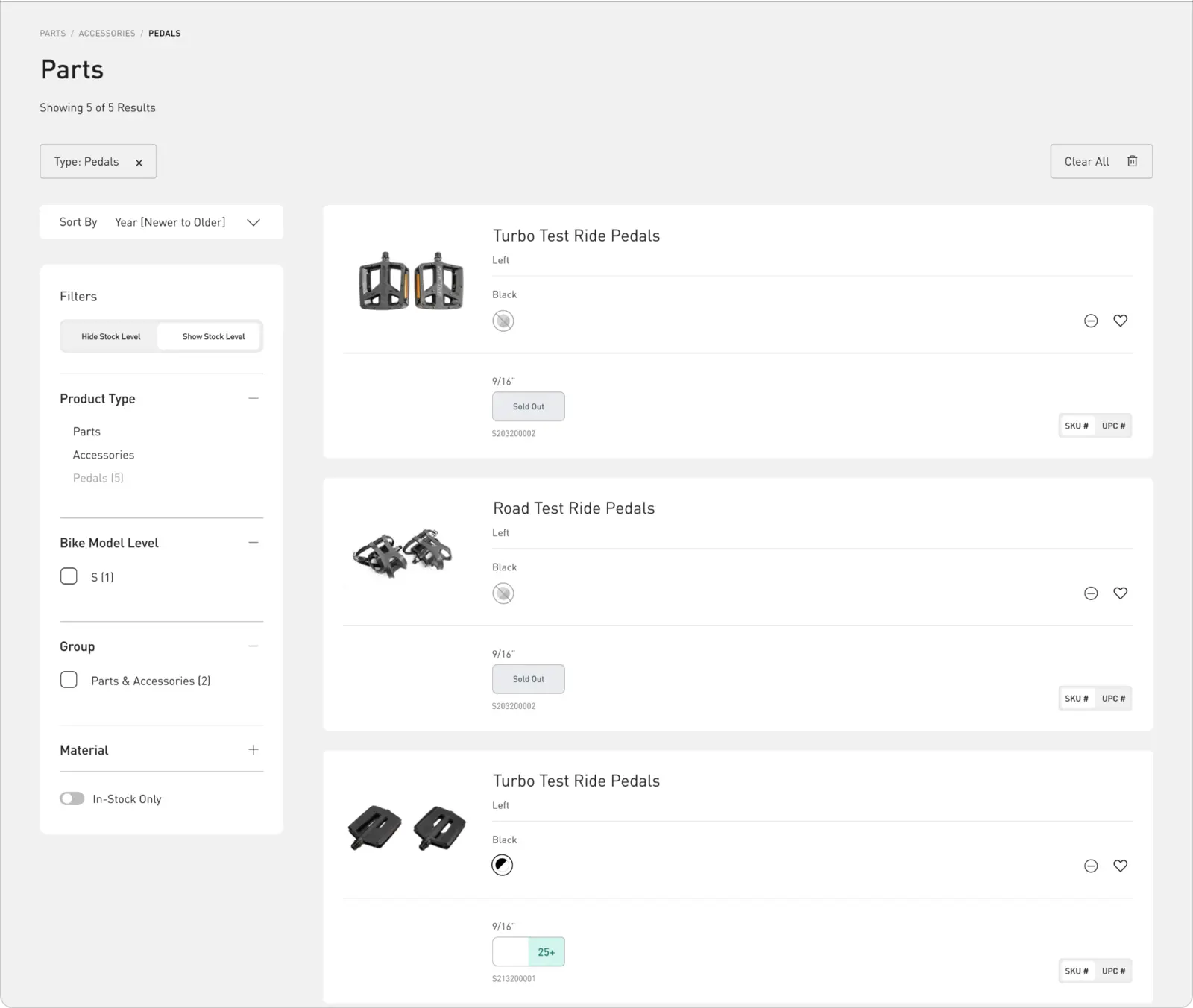
Previous B2B service-parts listing with large gaps and low information density.
The previous service-parts page used the same product-card pattern as sales. The wide cards left large gaps while only a few products remained visible.

design process

Ten list-view directions before converging

We explored ten variations of the listing in July 2024. The alternatives tested table density, expandable SKUs, stock states, pricing hierarchy and the amount of detail visible before opening a product.

The goal was not simply to fit more rows on screen. Each direction had to preserve the information retailers used to make an ordering decision.

decisions

Balancing routine work with a more familiar catalogue

Decision 01

Redesign the list instead of replacing it

Evidence. Retailers were already familiar with a list-based workflow, but the existing cards made poor use of the canvas and slowed comparison.

Choice. I redesigned the list to surface product, size, price, SKU and availability in a denser, more scannable hierarchy.

Consequence. The familiar workflow remained available with less wasted space and clearer access to the inventory information retailers checked most often.
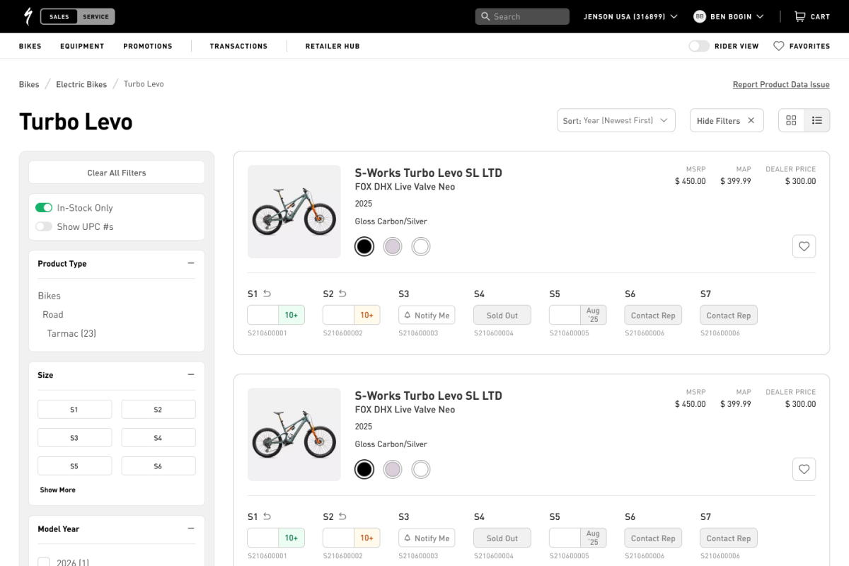
Redesigned list view with a denser product and inventory hierarchy.
The shipped list view became the default and used the desktop canvas more efficiently.

Decision 02

Add a grid for recognition and customer conversations

Design tension. A grid was unfamiliar to some experienced B2B users, but it matched a widely recognized e-commerce pattern and brought the platform closer to the company's B2C experience.

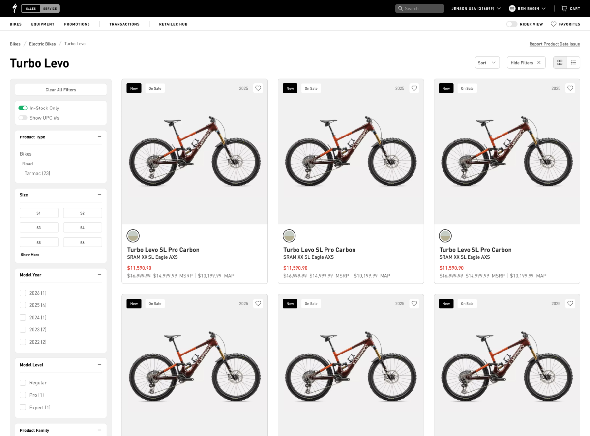
Choice. We introduced grid and list modes rather than forcing one presentation onto every task. The grid prioritized imagery for browsing and for store employees showing products directly to customers.

Consequence. New employees and customers could use a more familiar visual catalogue, while experienced users retained the denser list needed for operational work.

Grid view with product imagery, pricing and availability.
The optional grid aligned product discovery more closely with the consumer store.

Decision 03

Keep the list as default, then clarify the switch

We tested both grid-first and list-first versions. I proposed remembering each user's last selected view, so the interface would reopen in the mode that matched their routine. The team chose the list as a fixed default to reduce disruption for the existing user base.

The first release used icons alone to switch views. Prototype and post-release feedback showed that some users did not notice the control or thought information had disappeared in the grid. We replaced the icon-only treatment with explicit “List view” and “Grid view” labels, making the choice easier to understand.

Decision 04

Extend the shared language into the PDP

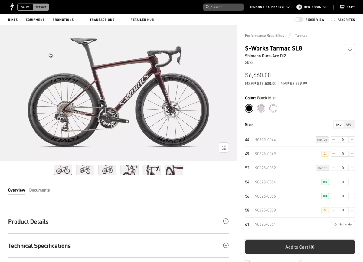
The product page carried the same balance into a deeper task: familiar product imagery and hierarchy from B2C, combined with retailer-specific pricing, quantities and technical information.

B2B product detail page with retail pricing and ordering controls.
The PDP reused the emerging shared design language while preserving B2B purchasing information.

outcome

What changed after release

Shipped scope

The redesigned PLP and PDP were implemented. Retailers responded positively to the more compact list because it improved scanning and used the available space more effectively.

Adoption feedback

The grid initially caused confusion, particularly for users with lower digital familiarity. Clear text labels and training improved comprehension, and retailers came to use the grid when presenting products to customers in store.

The evidence available for this case is qualitative. I use the feedback to explain adoption and design changes rather than claim an unsupported percentage improvement.

next case

Explore another project

View next case Back to all featured work